
The Public Defenders website was outdated and difficult to navigate making it hard for users to access critical information and resources.
Public Defenders are lawyers who represent individuals involved in high-profile criminal cases and cannot afford private legal services. They are independent of the government and work to ensure everyone has access to fair representation in court.
Beyond their legal work, Public Defenders publish research and materials on their website. These resources are widely referenced in legal cases and serve as valuable references for lawyers and law students.
I worked closely with business stakeholders to define the project’s scope and requirements. This meant making sure we were aligned on goals, resourcing and deadlines that set the pace for delivery. My focus was to deliver with an agile approach giving us space to iterate, test and refine designs along the way.
Our business goal was:
Create a modern website that communicates the Public Defenders' mission in a way that enhances trust and credibility for its services.
I wanted to understand how the primary users of the Public Defenders website (mainly law students and legal professionals including the Public Prosecutions Office and people working in legal-adjacent services). Using these research techniques, I identified key pain points, user needs and opportunities for improvement which informed the redesign.


Key findings
Our findings made it clear that the website redesign needed to focus on branding, consistency and user-centred design.
Hard-to-find information
Users wanted quick, easy access to legal resources. However, these resources were hard to find due to poor navigation structure, cluttered page layouts and a broken search function.
Outdated design style
Outdated branding and design styles did not inspire trust or confidence in Public Defender's services. Page layouts were text heavy and not engaging.
Does not meet business need
The user journey to request a Public Defender was confusing and difficult to navigate, resulting in low engagement with this service.
Inconsistent and inaccessible
Inconsistent structure and layout across landing and content pages. Incorrect use of heading levels and text colours meant it did not meet WCAG requirements mandated for government websites.

What some of the users said about the website

Prioritising what matters most
In the redesign, I considered user needs, business goals, feasibility and available resourcing. Given the project’s scope and time constraints, I prioritised the highest-impact areas that would provide the most value to users and business. These were:
Strengthen branding and reputation to align more closely with competitors in the legal industry.
Simplifying structure and navigation to find legal resources quickly and efficiently.
Improved search functionality to make sifting through large volumes of legal documents faster and more intuitive.
Setting up the structure
The site contained over 140 pages and 800+ documents requiring a comprehensive audit to identify redundancies and outdated information. However, reorganising the content wasn’t just about cleanup, we needed a structure that made sense to users.
Refining and evaluating the information architecture
I used tree testing to evaluate and refine the IA. From the results, I grouped resources and pages into categories that matched how users actually searched for information. The new IA made content easier to find, reducing confusion and unnecessary clicks. I also designed it to scale, so new cases, laws and resources can be added without a restructure.


Sketch early and often
Once I had the sitemap and had clarity on the content structure, my next step was sketching in low-fidelity.
Sketches have low consequences.
I use them as a tool to think about product layout without having to setup complex software first. My sketches are generally never shared with the team, they are simply for me to experiment with different layouts.

Wireframing and iterating
I wireframed several iterations of the designs and collected feedback from my design peers. Key improvements included:
Filterable search function: I replaced pages containing long lists of documents with a search function that allowed users to narrow search results by topics (date, case type etc.). This greatly improved the ability to find relevant documents quickly.
Landing page layouts: I worked on designing landing pages highlighting important content while breaking up dense information into digestible sections. This made the site more accessible and less intimidating for users.

Building credibility through strong branding
A key goal of the redesign was to reflect the Public Defenders' credibility and expertise through professional branding, while remaining approachable to a diverse audience.
My thinking behind the branding choices:
I applied the Public Defenders' existing brand colours, typography and logo consistently across the design to create a cohesive visual identity that aligned with their core values.
To enhance trust, I aligned the visual design with established government design conventions so users immediately recognise it as a credible source.

The redesign was a significant improvement in both usability and visual appeal. It achieved the business goals outlined by the Public Defenders while enhancing the overall user experience.
Refine search results with filters
A filterable search function that enables users to quickly find relevant cases, resources, and legal documents with improved speed and accuracy.

Modern layouts and interactions
Clean and intuitive UI that reflects the Public Defender's values, with cohesive branding applied consistently across all pages.

Clear navigation and content
An updated IA and navigation system that meant that users were never more than a few clicks away from important resources.
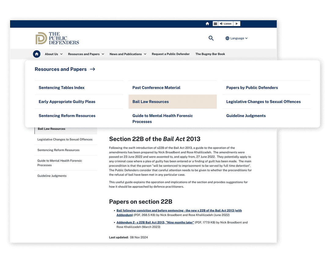
The redesigned website delivered tangible results for both users and the Public Defenders.
Usability test earlier
I focused heavily on heuristic evaluation and analytics due to budget constraints for this project. If I had more resources available to me, I would bring users to test wireframes before leaping into high fidelity designs.
Speed up the process with AI
With tools like Claude or V0 available now, I would use AI to speed up my design process. I could use it to help me transcribe and synthesise findings from the workshop, or build a functional prototype for stakeholders to visualise the end product before pushing through to development. This would free up my time to focus on strategic decisions rather than manual tasks.