
Parents were calling the founder directly to be matched with a carer for their childcare needs. For a startup trying to scale, this wasn't sustainable. The founder was spending time manually connecting parents and carers instead of building the business.
My goal was to understand why parents weren't booking through the platform and find a way to get them there without needing a human in the middle.
What did the current booking experience look like?
I wanted to get a clear picture of how our users went about booking their first childcare session. In order to get a better understanding of their painpoints and motivations, here are some research techniques I used.
Only ~10% of new users were making bookings on their own
(i.e. not contacting our team to set up a booking)
In contrast, customers who reached out for assistance had a much higher booking rate of ~80%. This significant gap led us to investigate the booking flow further as we hypothesied it was a key factor affecting new user conversions.
Key findings
The problem wasn't awareness or demand. Parents wanted the service. The app wasn't giving them enough to feel confident booking a carer on their own. The booking flow was asking parents to commit too early, before they had seen enough information about carers to feel confident. That finding directly shaped how we approached the design.
Trust and transparency
Parents needed more trust signals before choose they felt confident choosing a carer.
Need for social proof
They sought testimonials from other parents to feel confident in their decision.
Carer availabilities
Posting a job doesn’t guarantee a carer will apply, making the process unreliable for urgent or last-minute bookings.
Affinity map
After conducting in-person interviews, I used an affinity map to organise my observations and draw out the common themes.
Journey Map
I then places the common themes into a customer journey map. This helped me expose pain points and areas for improvement in the app along the booking journey.

Our research pointed to two core problems:
Parents couldn't confidently choose a carer
They couldn't rely on someone applying to their job.
We needed to decide where to focus and what to build. We ruled out more complex solutions like virtual carer introductions and recommendation algorithms early. Not because they weren't valuable but because they were too expensive to build for a team at this stage.
We needed solutions that would move the needle without requiring months of engineering work.
We landed on two solutions: a review system to address trust and redesigning the booking flow to give parents more control and certainty. Both had relatively simple design solutions but would create the most direct impact on conversion.
The booking flow redesign was the harder sell. The idea came from the design team and while we believed it was the right call, engineering pushed back because it meant rewriting significant backend logic. The CEO was on the fence too. The amount of effort required made everyone pause.
We made the case that without fixing the booking experience, no amount of polish elsewhere would move conversion. The review system alone wouldn't be enough. That argument landed and we got the green light to move forward.
Competitor analysis
Parents needed social proof before they would feel confident booking. The design decision that mattered most wasn't whether to build a review system. It was what kind of reviews would actually be useful.
I conducted a analysis of Uber, Airbnb and Google reviews to understand how other platforms structured feedback. The common pattern was category prompts, which provided guided questions that help reviewers provide specific details along with a star rating.

Concepts and testing
We applied the same principle to LittleHubs, but the categories needed to reflect what parents actually cared about. My initial assumption was that qualifications and experience would be the priority. Testing told us otherwise.
Parents cared far more about interpersonal qualities eg. how the carer connected with their child, whether they were easy to deal with and whether they were someone you'd want around your child.
Credentials mattered less than character.
The review design
After each booking, parents receive a notification to leave a review.
They are asked to select a star rating then provide further detail on certain categories based on the carer's qualities. The categories weren't strictly necessary for an MVP but they significantly improved review quality and gave parents the specific signals they needed to feel confident choosing a carer.
Additionally, a text field allows parents to leave comments on anything else they wanted to share.
Once the review is submitted, the carer receives a notification and it appears on their profile for other parents to see.
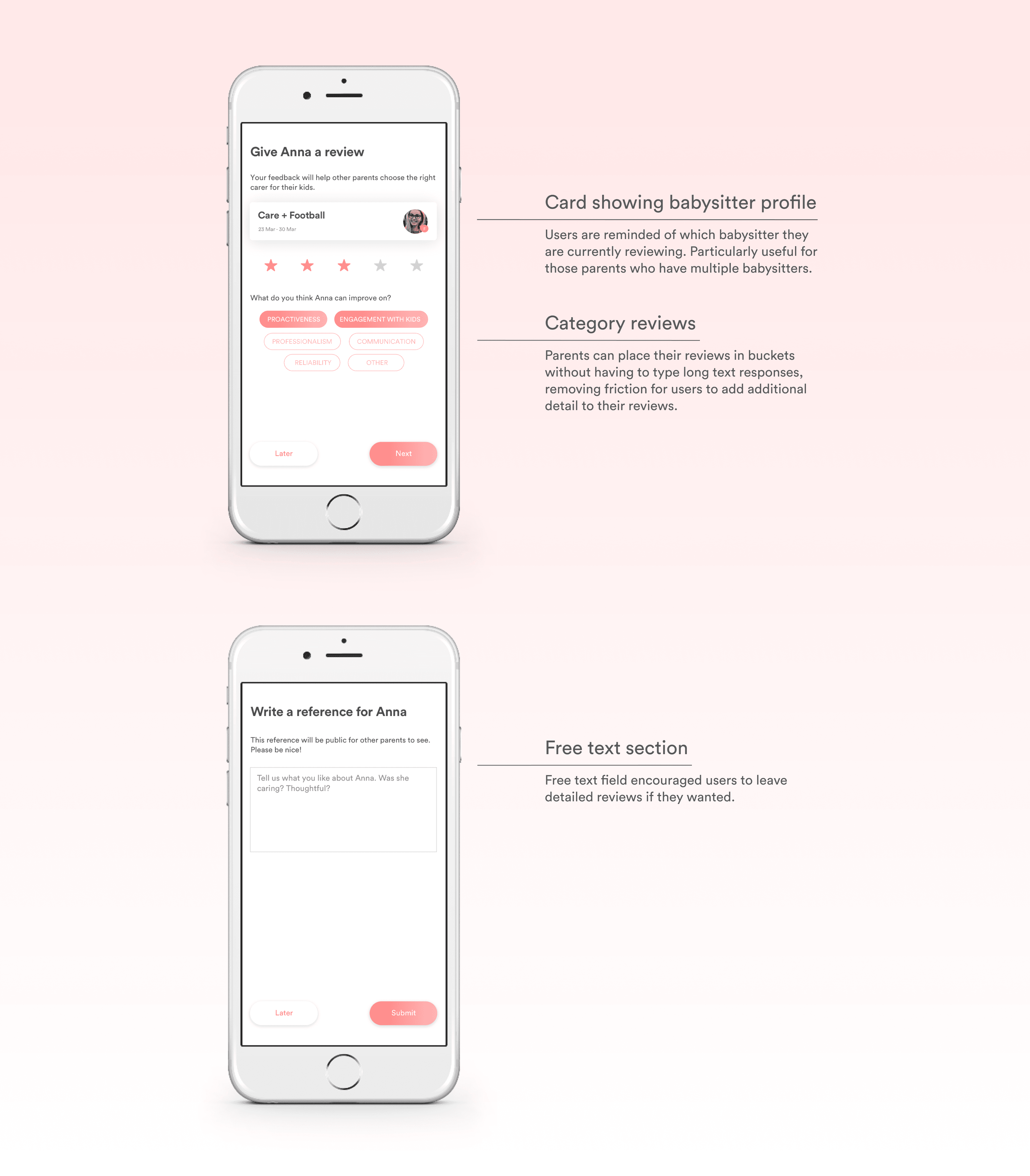
The review flow adapts based on the star rating.
Parents who rate highly are asked what they liked. Parents who rate lower are asked what the carer could improve on.
A deliberate choice to make feedback constructive rather than purely critical, which protected carers while still giving parents a meaningful voice.

The review system addressed trust but there was a second problem. Even if parents found a carer they liked, the booking process itself was unreliable. Parents had to post a job listing and wait for carers to apply. There was no guarantee anyone would.
For last minute or urgent bookings, that uncertainty was enough to make parents pick up the phone instead.
The new model
Rather than parents posting a job and waiting to be found, we introduced a screen where carers were surfaced based on the family's requirements. Parents could browse, choose a carer directly and send a booking request. The uncertainty of waiting was removed.
We flipped the booking process: from parents waiting to be found, to parents doing the choosing.

Rather than designing new screens from scratch, we repurposed and reorganised existing screens to support the new flow. A conscious decision to minimise engineering effort given the pushback we had already navigated. The result was a significantly better experience without a full rebuild.
Usability testing validated the new flow without requiring structural changes. Parents found it more intuitive and the sense of control came through clearly in feedback.

These solutions helped build trust between parents and carers while supporting more informed decision-making and reducing uncertainty in the booking process.