When people visit a government website they're not browsing. They're looking for something specific and often urgent. A court date. Domestic violence support. A justice of the peace. They come to DCJ's websites because the government is a trusted source of information.
DCJ manages over 40 of these websites, serving audiences ranging from 1,000 to 1.7 million people a year. Keeping that many websites consistent and up to date was an operational challenge, and the team had no shared foundation to build from.
My role was to help turn that vision into a working system.
Without our own design system in place, our designers and developers often spent time recreating designs from scratch or resolving inconsistencies in components, which led to slower delivery and increased effort for every project.
Three teams. Three disconnected experiences.
To kick off the project, I analysed the NSW Government's Design System to understand its limitations. I engaged design and development teams early to uncover pain points, design needs, and technical constraints. Then worked closely with designers, developers and senior stakeholders to gather requirements and align on the system’s goals and direction.
The NSW Government already had a design system but it wasn't built for us. It was designed for Drupal (a different CMS entirely) and maintained by a separate team we had no direct access to. Despite sharing the same branding rules, we operated like separate organisations. We could inherit their foundations (colour, typography, the overall look and feel) but we couldn't use their components as they were. We had to extend on them for DCJ's specific needs and technical environment.

Why the NSW system wasn't enough?
With 5 developers and 2 designers all splitting time across other projects, we couldn't afford to build everything at once. I teamed up with the design and engineering teams to review AEM components, design assets and code. Together, we identified inconsistencies and prioritised what to build first.
A component audit across existing sites scored each component on pre-set criteria including: how frequently it was used, how many sites would benefit and whether it had severe accessibility or technical issues.
Our strategy was to focus on high-value low-effort improvements, such as addressing accessibility issues and building the most frequently used first.
Hero banners, cards, navigational elements, footers and layout components came out on top. These became part of the first release.

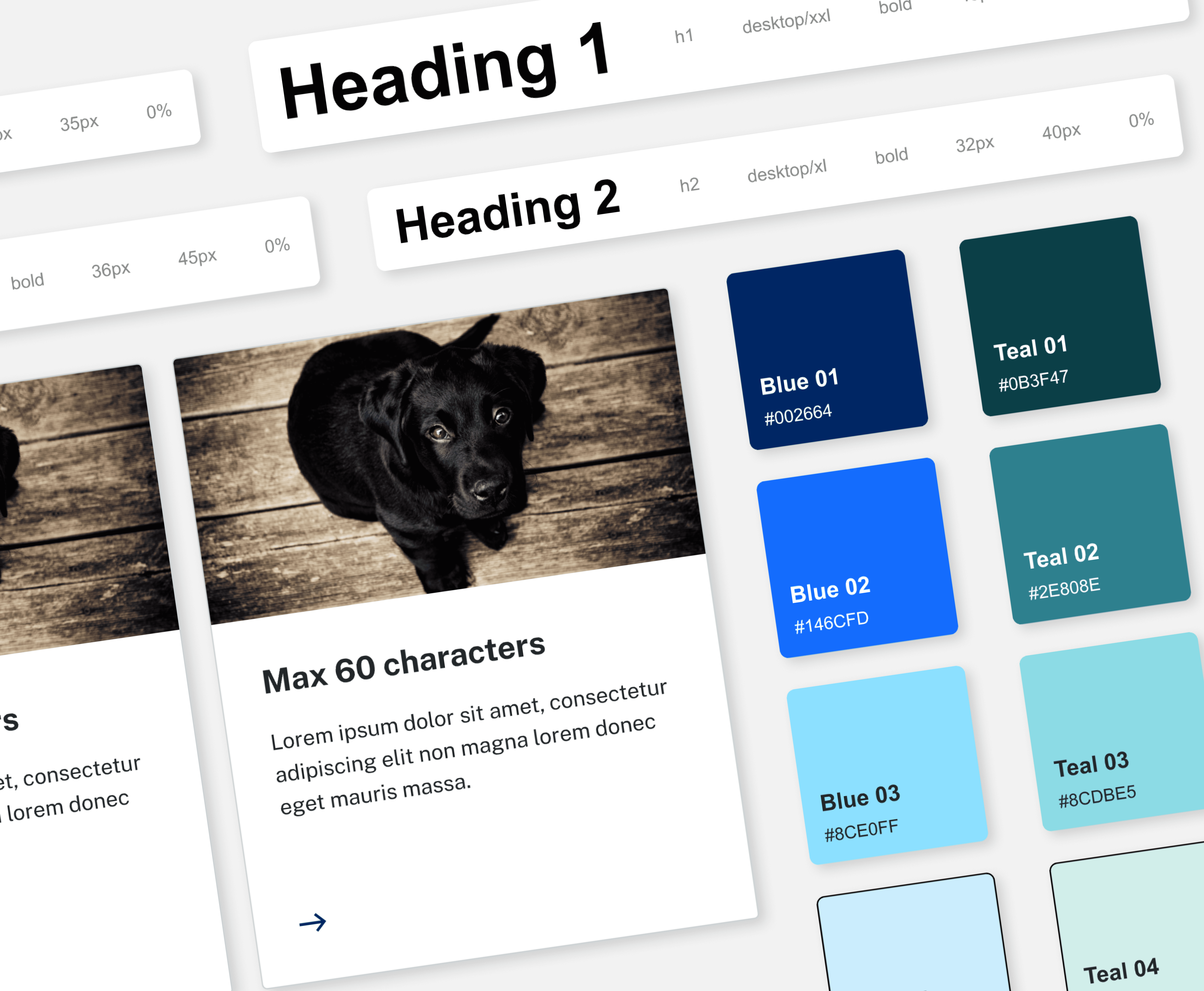
Our design system is made up of foundations and components. Together, these building blocks enable us to create cohesive and accessible designs that meet the unique needs of DCJ’s websites.
Building the foundations
The design system only works if all three teams are speaking the same language. That was the problem we set out to solve with tokens.
Before a single component was designed, we agreed on a shared naming convention across Figma and the codebase. Colour, typography and spacing were defined first in Figma and mapped directly to CSS styles in the codebase. A colour token named "primary-blue" in Figma had an identical CSS variable in the dev library. Same for typography and spacing. Developers didn't need to ask what a colour was. They looked at the token name and know exactly which CSS style to apply.

What become a component?
Components combine foundational elements to address specific design needs. These are the interactive and reusable pieces that form the core of our UI.


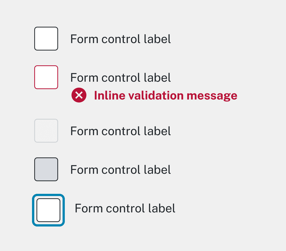

For each component, we designed two things: the component as it appears on the website and the authoring interface content authors would use to configure and publish it in AEM. Getting that interface right meant authors could build pages that matched the design without needing a designer in the room.
Most design systems stop at the first problem. We had to solve both.

Accessibility considerations
Every component was tested with real users including people with disabilities and people who spoke english as a second language through a mix of agency and our internal accessibility team. Accessibility wasn't optional.
I created documentation and training resources to make sure the design system was actually adopted across the team.
Documentation detailing how to use the design system, including guidelines for page templates, typography, colour and accessibility.
Guidelines for content authors on website authoring and adding modules in AEM.
Training session for our design team to ensure everyone understood how to use the system.

Testing and feedback
We tested the design system on our team's next project, which gave us immediate and practical feedback on what was working and what wasn't. I stayed close to the build the whole way through. That meant regular check-ins with engineers, helping QA and testing edge cases during handovers and after we went live.
Content authors were also a key source of feedback. Their experience using the components in AEM directly shaped how we improved the authoring experience and documentation.
The design system in use
Examples of the pattern library applied on various DCJ websites.

By creating a common language between designers and engineers, the DCJ design system not only saved time and resources but also aligned with broader organisational goals of delivering consistent and accessible experiences across the department.
While it required a lot of work upfront, having a set of patterns means we now have a smooth process from design to build to publishing.
Developers could pull predefined tokens and components directly from the library without asking for more details. The back and forth that used to require meetings dropped significantly.
Service requests for help and custom component builds reduced as authors were able to self-serve more confidently using the authoring guides. What they published in AEM matched what was designed in Figma.
For the end-users of DCJ's websites, a consistent and accessible experience is now the default. Every site that migrates to the new system inherits WCAG AA compliance automatically. It lifted the barriers for everyday people navigating critical and complex government information.
Protect the system earlier
Every component we added had a cost: developer time, regression testing, ongoing maintenance. We pushed back on one-off requests but leadership had the final say. Some components were built for a single site and never reused. Next time I'd make the cost of exceptions visible before the decision is made.
Set up governance from day one
We introduced a change log and continuous feedback loops to track updates but we added them later than we should have. Clear governance, version control and documentation keep the system robust and scalable as our team and needs evolve.
Invest in adoption early
Documentation and training were part of the rollout but adoption across non-design teams took time. In particular, they were accustomed to their own methods and changing established habits was harder than building new ones.
I'd involve those teams earlier in the process so the system felt like something built with them rather than handed to them.